
Let's start with a simple truth: you can't be a great data scientist if you don't have a solid grasp of fundamental statistics. Statistics is the grammar of data, the underlying structure that allows us to find meaning in all the noise. And one of the very first, most critical concepts to master is the difference between a population and a sample.
This isn't just academic theory—it's a practical idea that shapes almost every analysis you'll ever perform.
Why Statistics Is Your Data Science Superpower
Imagine you're a chef who has just made a giant pot of soup. Before you serve it, you need to check the seasoning. Do you drink the entire pot? Of course not. You take a single spoonful. That simple action is a perfect analogy for one of the most foundational ideas in statistics.
In this scenario:
- The entire pot of soup is the population—the complete set of everything you want to study.
- The spoonful you taste is the sample—a small, manageable piece of that population.
Your goal is to use that one spoonful (the sample) to make an intelligent guess about the entire pot (the population). If the spoon tastes right, you can confidently infer the whole pot is ready. This is the very heart of inferential statistics: using a small amount of data to draw big-picture conclusions.
From Soup to Software
This concept translates directly into the world of data science. Think about it: companies almost never have access to data from every single potential customer, user, or transaction. It’s usually too expensive, would take far too long, or is just plain impossible to gather information on an entire population.
Practical Example: A mobile gaming company wants to know the average daily playtime of all its 10 million users (the population). Instead of analyzing every single player, they pull data from a random group of 50,000 active users (the sample). The insights from this sample help them make decisions about server capacity and in-game events for the entire user base.
Instead, we work with samples. Whether we're analyzing user behavior, testing a new feature, or building a predictive model, we're using a subset of the data to understand the whole. For instance, government agencies like the U.S. Census Bureau use sophisticated sampling methods to create their population estimates because surveying every single person isn't feasible.
Population vs Sample At a Glance
To make this distinction crystal clear, here’s a side-by-side comparison.
| Characteristic | Population | Sample |
|---|---|---|
| Definition | The complete collection of all items or individuals of interest. | A subset of the population selected for analysis. |
| Size | The total number of items, denoted as N. | A fraction of the population, denoted as n. |
| Goal | To get parameters (e.g., population mean, µ). | To get statistics (e.g., sample mean, x̄) to estimate parameters. |
| Data Collection | Often impractical or impossible due to cost, time, or logistics. | Practical and efficient; data is actively collected from this group. |
| Example | All registered voters in a country. | 1,000 voters randomly selected for a political poll. |
Understanding this table is key. We almost always work with the "Sample" column to make educated guesses about the "Population" column.
The Importance of a Representative Sample
Here’s the catch: your insights are only as good as your sample. If your "spoonful" of soup isn't a good representation—maybe you only scooped from the very top where the heavy ingredients haven't settled—your conclusion will be dead wrong.
Actionable Insight: An unrepresentative sample is the fast track to misleading results. The goal is to select a sample that mirrors the characteristics of the population as closely as possible, ensuring your findings are both accurate and reliable.
This is exactly why proper data collection and sampling techniques are so critical. Whether you're running A/B tests on a website, conducting market research, or analyzing product logs, the validity of your entire project hangs on having a sample that isn't biased.
Your superpower as a data scientist truly begins here—with the ability to make smart, defensible inferences about the whole picture from just a small piece of it.
So, you've got a pile of data. What's the first thing you want to know? Usually, it's something like, "What does a typical value look like?" This is where the concept of central tendency comes into play. It’s one of the most fundamental tools in statistics, giving you a single, representative number that sums up your entire dataset.
Think of it as finding the "center" of your data. But here's the catch—there are a few different ways to define that center, and each tells a slightly different story. The three most common measures are the mean, median, and mode, often called the "three Ms." Knowing which one to use is the key to painting an accurate picture of what your data is actually telling you.
Let's make this real. Imagine you run an e-commerce store and you look at the last 10 customer purchases: $15, $20, $20, $25, $30, $35, $40, $45, $50, and then—wait for it—one massive $500 purchase.
Now, let's see how our three measures of central tendency would interpret this.
Finding the Center with Mean, Median, and Mode
Each of the "three Ms" gives you a unique lens to view your data's central point. The right one to choose depends entirely on your data's shape and the question you're trying to answer.
-
The Mean (or Average): This is the one you probably remember from school. Just add up all the values and divide by how many there are. In our example, the total comes to $780. Divide that by 10 sales, and you get a mean of $78. But hang on. Does $78 really feel like a "typical" purchase when nine out of ten sales were $50 or less? That one $500 outlier dragged the average way up. This is the mean's biggest weakness—it's easily skewed by extreme values.
-
The Median (the Middle Value): The median is simply the number that sits squarely in the middle of your data once you've sorted it. With 10 values, our "middle" falls between the 5th value ($30) and the 6th value ($35). To find the median, we just average those two, giving us $32.50. Now that feels much more honest. It gives a better sense of a typical customer's spending because it completely ignores that one unusually large purchase.
-
The Mode (the Most Frequent): This one's the easiest of all. The mode is just the value that shows up most often. In our dataset, $20 appears twice, more than any other number, so our mode is $20. Practical Example: A clothing retailer uses the mode to determine the most popular T-shirt size sold each month. This directly informs their inventory orders, ensuring they don't run out of bestsellers.
Actionable Insight: Your choice of measure directly shapes the story you tell. If you used the mean to describe customer spending, you might mistakenly believe your average customer has a much bigger budget than they actually do. The median often provides a more robust and realistic summary when outliers are lurking in your data.
Getting a handle on these distinctions is more than just a statistical exercise; it's a foundational step for more advanced analysis. For instance, when you eventually want to figure out if the difference between two group means is actually meaningful, you'll need to know exactly how those values were calculated in the first place.
To see how this connects to the next level of analysis, you can dive deeper into statistical significance and confidence intervals in our detailed guide. Choosing the right measure ensures your data's story is accurate right from the start.
Understanding the Shape of Your Data with Dispersion

While measures of central tendency give you a single point to summarize your data, they only tell half the story. To truly grasp your data’s personality, you need to understand its dispersion—or, more simply, how spread out the values are. Dispersion measures tell you about the consistency and variability within your dataset.
Think of two basketball players who both have a mean score of 20 points per game. At first glance, they seem identical. But what if one player consistently scores between 18 and 22 points every night, while the other swings wildly between scoring 40 points one game and only 2 the next?
They have the same average, but their performance stories are completely different. The first player is reliable and predictable; the second is volatile and high-risk. Measures of dispersion are what allow us to quantify this difference and understand the "shape" of the data beyond its center.
Quantifying the Spread: Range, Variance, and Standard Deviation
To move beyond just a gut feeling about consistency, we use specific statistical tools. These are the most common measures of dispersion, and each one offers a unique insight into your data's spread.
-
Range: This is the simplest measure of all. It’s just the highest value minus the lowest value. While it's a breeze to calculate, it can be misleading since it’s entirely dependent on the two most extreme outliers.
-
Variance: This gives you a sense of how far each data point is from the mean, on average. A larger variance means the data points are much more spread out from the center.
-
Standard Deviation: As the square root of the variance, this is the most widely used measure of spread. Its real power is that it’s expressed in the same units as the original data, making it far more intuitive to interpret.
Actionable Insight: Standard deviation is your go-to metric for gauging consistency. A small standard deviation indicates that data points are clustered tightly around the mean, signaling high consistency. A large standard deviation means the data is widely scattered, indicating low consistency or high variability.
Practical Application: Why Dispersion Matters
Understanding dispersion is absolutely critical for making informed decisions. In finance, for example, standard deviation is a primary measure of an investment's volatility and risk. A stock with a high standard deviation in its daily price is considered riskier than one with a low standard deviation. In manufacturing, it helps monitor product quality by ensuring items coming off the assembly line are all within a tight, consistent specification.
This concept extends to large-scale analysis, too. For instance, variance and standard deviation quantify how data varies around a central value, which is vital for policy assessment and forecasting. A high standard deviation in population growth rates across different regions can signal major demographic shifts, helping governments allocate resources more effectively.
Ultimately, these measures are foundational for more advanced statistical methods. Understanding variability is a key step before you can determine the certainty of your findings—a concept we explore when discussing the significance level and confidence level in statistical tests. It's all about seeing the complete picture, not just the average, but the full story of your data's behavior.
Making Educated Guesses with Probability
So far, we’ve been looking in the rearview mirror, describing data we already have by finding its center and measuring its spread. Now, it’s time to shift our gaze and look forward. This is where we start making educated guesses about what’s to come, and our tool for this is probability—the art and science of putting a number on uncertainty.
Probability is what lets us move from asking "what happened?" to "what's likely to happen?" It’s the mathematical engine behind forecasting, prediction, and honestly, some of the most powerful work in data science. Without it, we’re just recounting history. With it, we can start to shape the future.
The Bell Curve in Everyday Life
One of the most famous and surprisingly common ideas in statistics is the Normal Distribution. You probably know it as the "bell curve" because of its distinctive, symmetrical shape. You’ve seen this pattern all over the place, even if you didn't have a name for it.
Think about the heights of adults in a large group. Most people will cluster right around the average. As you get further from that average, in either direction, you find fewer and fewer people. The extremely tall and the extremely short are outliers, making them rare. This creates that classic bell shape.
Practical Example: A call center knows that the average call duration is 300 seconds (5 minutes) with a standard deviation of 30 seconds, and the durations follow a normal distribution. Using this, they can predict that about 95% of all calls will last between 240 and 360 seconds (mean ± 2 standard deviations). This helps them with staff scheduling and performance targets.
Getting a feel for this distribution is a genuine superpower. If you know your data fits a normal distribution, you can start calculating the odds of seeing any particular value. For a data scientist, this means you can spot when a result is just business-as-usual or when it’s so unusual it might be statistically significant.
Actionable Insight: The Normal Distribution gives us a universal blueprint for understanding randomness and variation. If you know the mean and standard deviation, you can predict the probability of any outcome, turning raw uncertainty into a calculated risk.
From Probability to Prediction
This isn't just a theoretical detour. The principles of probability and distributions are the absolute bedrock of many machine learning models and advanced statistical methods. For example, the assumption that data is "normally distributed" is a key ingredient in many forms of hypothesis testing—the process we use to decide if an effect we're seeing is real or just a fluke of random chance.
These concepts are also absolutely essential for forecasting. If you want to see how these ideas play out in the real world, our guide on the ARIMA model in Python is a great next step. It shows how time-series data can be used to make predictions about the future. Models like ARIMA lean heavily on the statistical properties of the data to project what’s coming next.
The takeaway is simple: learning to quantify chance is the first step toward making reliable, data-backed predictions about your business, your customers, or your market. It’s how data science makes the leap from simple description to confident decision-making.
So, how do you actually prove that a change you made—say, to a website or an app—had a real, measurable impact? You can't just go by gut feelings or what a few people say. You need data, and more importantly, a structured way to interpret that data.
This is where hypothesis testing comes in. While it might sound like something straight out of a statistics textbook, it's one of the most practical tools in a data scientist's arsenal.
Let’s stick with a classic scenario: you've launched a new website design featuring a slick, redesigned "Buy Now" button. The big question is, does this new button actually get more people to click? Hypothesis testing provides a scientific process to get a real answer.
Your Starting Assumption: The Null Hypothesis
The first step in any test is to state your starting assumption. In statistics, we call this the null hypothesis (H₀). It's essentially a statement of "no effect" or "no difference." It’s the default state of the world we assume to be true until we can prove otherwise.
For our A/B test, the null hypothesis would be simple: "The new button has no effect on the click-through rate."
Your entire goal as an analyst is to challenge this default assumption. You want to gather enough evidence to prove it wrong and confidently declare that your new design did make a difference. This competing claim is called the alternative hypothesis (H₁).
The infographic below shows just how straightforward this decision-making flow can be.
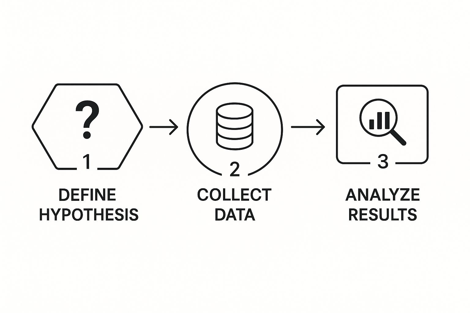
It’s a simple, repeatable loop: define your question, analyze the results, and make a data-backed choice.
Measuring Surprise with P-Values
So, how much evidence is enough to toss out that null hypothesis? This is where the p-value enters the picture. Don't get lost in the complex formulas; just think of the p-value as a "surprise-o-meter."
Actionable Insight: A p-value measures how surprising your data is, assuming the null hypothesis is true. A small p-value (the industry standard is typically less than 0.05) means your results would be a huge coincidence if the new button truly had no effect. This allows you to make a confident decision to roll out the new feature.
If that p-value is low enough, you have strong evidence to reject the null hypothesis. You can finally say, with statistical confidence, that the change you made had a significant impact. This process is the bedrock of sound business decisions, from optimizing marketing campaigns to refining product features.
To make this process crystal clear, here’s a simplified breakdown of the steps involved in a typical hypothesis test.
Hypothesis Testing Steps for Beginners
| Step | Action | Practical Example (A/B Test) |
|---|---|---|
| 1 | Formulate a Question | "Does our new 'Buy Now' button increase clicks?" |
| 2 | State the Null Hypothesis (H₀) | "The new button has no effect on the click-through rate." |
| 3 | State the Alternative Hypothesis (H₁) | "The new button increases the click-through rate." |
| 4 | Set the Significance Level (α) | Choose a threshold, usually α = 0.05. This is your "surprise" threshold. |
| 5 | Collect and Analyze Data | Run the A/B test and calculate the click-through rates for both buttons. |
| 6 | Calculate the P-Value | Perform a statistical test (like a t-test) to get the p-value. |
| 7 | Draw a Conclusion | If p < 0.05, reject the null hypothesis and roll out the new button. If not, the change wasn't impactful. |
This framework isn't just for one-off decisions. The same principles of testing a hypothesis and monitoring outcomes are vital long after a feature is launched. For example, continuous testing is a core part of effective machine learning model monitoring, where you constantly check if a model's performance is degrading.
By applying this structured approach, you move from just guessing to truly knowing, using data to validate every strategic choice you make.
Finding and Modeling Relationships in Your Data
This is where the real fun begins. Once you’ve gotten a feel for your data by looking at individual variables, the next step is to uncover how they interact. We're moving from simply describing a dataset to spotting connections, testing their strength, and ultimately building models that can predict what might happen next.
Two of the most fundamental tools for this are correlation and regression.
Let’s imagine you're a marketing manager trying to figure out if your ad campaigns are actually working. You pull the data for the last twelve months, plotting how much you spent on ads against the total sales for each month. A quick glance at the chart might show a clear pattern: the more you spent, the more you sold. That initial "aha!" moment—that observed connection—is correlation.
Correlation Sees the Pattern
Correlation is a statistical measure that tells you about the strength and direction of a relationship between two variables. It's an essential first step in almost any analysis, but it comes with a massive warning label that every data professional has to burn into their brain.
Actionable Insight: The golden rule of statistics is this: correlation does not imply causation.
Just because sales and ad spend moved together doesn't prove the ads caused the sales bump. A third, hidden factor—like a booming economy, a competitor's misstep, or even a seasonal trend—could be pushing both numbers up. Acting on a hunch that a correlation equals causation can lead to some seriously bad business decisions. Think of correlation as a signpost pointing you in an interesting direction, not the final destination.
Regression Builds the Model
So, you've found a correlation that looks promising. How do you turn that observation into something you can use to make predictions? That's where simple linear regression comes into play.
Regression takes things a step further than just saying, "these two things are related." It provides a mathematical equation—a straight line—that best fits the pattern in your data points. This line becomes your predictive model.
Using our marketing example, a regression model could help answer questions like, "If we bump our ad budget by $10,000 next month, what's our most likely sales figure?" This is precisely how businesses turn historical data into forward-looking intelligence, whether they're forecasting revenue, estimating customer churn, or planning inventory.
Of course, no model is ever perfect. The real challenge is building a model that's genuinely useful and minimizes error. This often means navigating the fine line between a model that's too simple (high bias) and one that's too complex and overfits the data (high variance). As we've covered before on Datanizant, a deep understanding of the bias-variance tradeoff is absolutely critical for creating models that perform well on new, unseen data.
By moving from just seeing relationships with correlation to actually modeling them with regression, you’re making a huge leap from basic analysis to the very core of predictive data science.
Frequently Asked Questions About Basic Statistics
As you get your hands dirty with data, a few key questions almost always pop up. Here are some of the most common ones I hear, along with practical, real-world answers.
What Is The Most Important Concept To Learn First?
If I had to pick just one, it would be population versus sample. It’s a concept that underpins nearly everything else in statistics.
Practical Example: A political pollster can't possibly survey every single voter in a state (the population). Instead, they talk to a smaller, representative group of 1,000 voters (the sample) to predict how the entire election will turn out. The actionable insight here is that understanding this distinction is key to interpreting polls and market research correctly, so you know how much confidence to place in their conclusions.
When Should I Use Median Instead Of Mean?
You'll want to reach for the median whenever your dataset has significant outliers that could throw off your results.
Practical Example: Imagine you're analyzing home prices in a neighborhood. The mean (or average) price could be massively skewed upwards by one huge mansion. It wouldn't really represent what a typical house costs. The median, on the other hand, gives you the true middle value, offering a far more realistic picture for both buyers and sellers. This provides the actionable insight needed to price a home competitively.
At DATA-NIZANT, we provide expert-authored articles that break down complex data science topics into clear, actionable insights. Explore our analyses on everything from machine learning to digital infrastructure at https://www.datanizant.com.

