
Unlocking the Power of Data Visualization
Effective data visualization is crucial for conveying complex information and driving data-informed decisions. This listicle outlines eight data visualization best practices to help you create impactful visuals that clearly communicate your insights. Learn how to choose the right chart type, maintain a good data-ink ratio, use consistent color palettes strategically, prioritize clear labeling, implement proper scale, design for your audience, embrace simplicity, and support interactive exploration. Following these data visualization best practices will enhance your presentations, reports, and analyses, regardless of the platform—from spreadsheets to specialized tools like DATA-NIZANT.
1. Choose the Right Chart Type
Selecting the right chart type is the cornerstone of effective data visualization, a core tenet of data visualization best practices. Different visualizations are designed for different purposes. Just as a hammer is best for driving nails and a saw for cutting wood, different chart types excel at communicating particular insights from your data. Choosing the wrong format can obscure the story you're trying to tell, or worse, mislead your audience. A mismatched chart can transform meaningful data into confusing noise, undermining the very purpose of data visualization. Therefore, carefully considering the relationship between your data and your message is the first crucial step in any successful visualization endeavor.
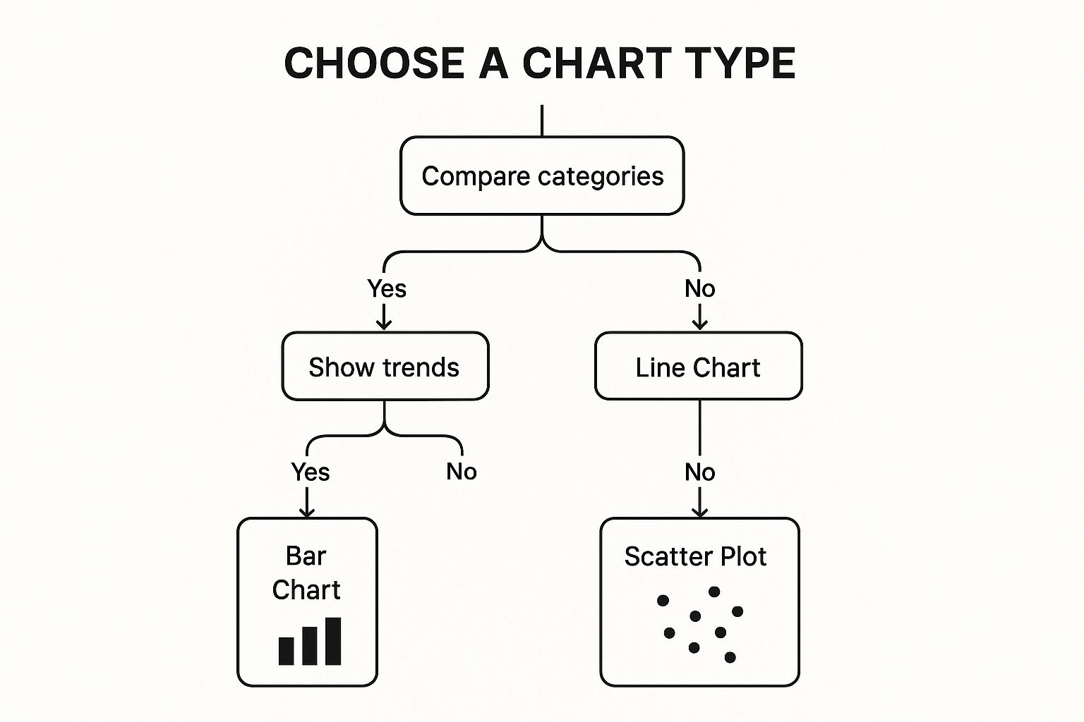
This decision tree infographic provides a simplified framework for selecting the appropriate chart based on the intended message. It guides you through key decisions, starting with whether you are comparing values, showing composition, understanding distribution, or analyzing trends.
Features like data-to-visualization mapping guidance and audience consideration are built into this selection process. Context is paramount: a chart suitable for a technical report might be too complex for a general audience. This emphasizes the importance of context-appropriate visualization selection as a key feature of this best practice.
Successful data visualization examples abound. The Financial Times effectively uses bar charts for economic comparisons and line charts to illustrate market trends. The New York Times employed area charts to track cumulative COVID-19 cases, providing a clear visual representation of the pandemic's progression, while using bar charts for daily changes to highlight fluctuations. Hans Rosling, in his renowned TED talks, leveraged animated scatter plots to dynamically illustrate global health trends over time. These examples underscore the impact of choosing the right visualization for the specific data and narrative.
Here are some actionable tips to guide your chart selection:
- Comparing Categories: Use bar charts for a clear comparison of discrete values.
- Showing Trends Over Time: Line charts effectively display changes in data over continuous periods.
- Showing Correlations: Scatter plots reveal relationships between two variables.
- Displaying Parts of a Whole: Pie charts (use sparingly with few categories) or treemaps are suitable for showing composition.
- Create a Decision Tree: Develop a decision tree like the infographic above for your organization to streamline chart selection and ensure consistency in data visualization best practices.
While choosing the right chart type significantly improves data comprehension and reduces cognitive load for viewers, thereby preventing misinterpretations, it's not without its challenges. Determining the optimal format can sometimes require expertise. It may necessitate creating multiple visualization types to test effectiveness. Furthermore, complex data patterns often require specialized visualization types beyond the common ones discussed here. The pros undoubtedly outweigh the cons, making this a fundamental principle of data visualization. Learn more about Choose the Right Chart Type This principle has been popularized by influential figures like Edward Tufte in "The Visual Display of Quantitative Information" and Stephen Few in "Show Me the Numbers", and is reflected in resources like Tableau Software's Visual Best Practices guidelines. This first step ensures that your data visualization efforts are built on a solid foundation, leading to clearer communication and more impactful insights.
2. Maintain Data-Ink Ratio
A crucial best practice in data visualization is maintaining a high data-ink ratio. This principle, popularized by Edward Tufte in "The Visual Display of Quantitative Information," emphasizes maximizing the proportion of "ink" (or pixels on a screen) used to display actual data compared to non-data elements. In essence, it's about prioritizing clarity and efficiency by stripping away any visual clutter that doesn't contribute to understanding the data. This approach helps create cleaner, more impactful visualizations that facilitate faster comprehension and reduce cognitive load for viewers, making it a vital element of effective data visualization best practices.
This method works by ruthlessly eliminating what Tufte calls "chartjunk" – decorative graphics, excessive gridlines, unnecessary 3D effects, and other non-data elements that distract from the core message. Instead of relying on embellishments, a high data-ink ratio visualization focuses on presenting the data directly and effectively. This optimization of the visual presentation streamlines the cognitive processing required to understand the information, allowing viewers to grasp insights more quickly and accurately.
Features of High Data-Ink Ratio Visualizations:
- Elimination of chartjunk and decorative elements: Ornamental graphics offer no analytical value and are actively discouraged.
- Focused presentation of data without distractions: The visualization directs attention to the data itself.
- Optimization of cognitive processing: Clear visuals minimize the mental effort required to decode the information.
Pros:
- Improves comprehension speed: Viewers grasp insights faster.
- Reduces cognitive load: Simplifies the mental processing of information.
- Creates more professional-looking visualizations: Clean design conveys competence and credibility.
- Works well across different display sizes: Scalability is improved by minimizing unnecessary elements.
Cons:
- Can sometimes result in overly minimalist designs: Stripping away too much can occasionally hinder understanding, particularly for audiences unfamiliar with the data.
- May remove contextual elements that aid certain audiences: Some viewers may benefit from additional context provided by elements deemed "unnecessary" by strict data-ink ratio standards.
- Requires careful judgment about what constitutes unnecessary elements: Balancing minimalism with necessary context requires careful consideration.
Examples of Successful Implementation:
- The Economist: Known for its clean, data-driven charts with minimal gridlines and no decorative elements.
- Bloomberg: Financial charts prioritize data presentation, minimizing formatting and extraneous details.
- Edward Tufte's Challenger Disaster Redesign: Tufte famously redesigned the chart showing O-ring performance and temperature, highlighting the critical data that contributed to the disaster, which was obscured in the original cluttered presentation.
Actionable Tips for Maintaining a High Data-Ink Ratio:
- Remove gridlines or make them very light: Gridlines should only be used if they genuinely aid interpretation and should be visually subtle.
- Eliminate borders around the plot area: Borders rarely add value and can distract from the data.
- Avoid 3D effects entirely: 3D often distorts data perception and adds unnecessary complexity.
- Use direct labeling instead of legends when possible: Directly labeling data points reduces the need for viewers to cross-reference a legend, improving clarity.
- Remove redundant information and decorative elements: Every element should serve a clear purpose in conveying information.
- Keep backgrounds white or very subtle: A neutral background helps the data stand out.
When and Why to Use This Approach:
The data-ink ratio principle is particularly relevant for data scientists, AI researchers, and business executives who need to communicate complex information clearly and efficiently. It's essential for creating visualizations for presentations, reports, dashboards, and publications where clarity and impact are paramount. By maximizing the data-ink ratio, you ensure that your visualizations effectively communicate the story within the data, empowering your audience to quickly grasp key insights and make informed decisions. This is particularly valuable in data-driven fields where accurate and efficient communication of complex information is crucial for success.
3. Use Consistent Color Palettes Strategically
Strategic color usage is a cornerstone of effective data visualization best practices. It goes beyond mere aesthetics and focuses on leveraging color to enhance comprehension and highlight key insights within the data. Instead of randomly assigning colors, a strategic approach involves carefully selecting color schemes that align with the data's nature and purpose. This encompasses utilizing color consistently to represent specific categories, applying appropriate sequential or diverging color scales for quantitative data, and ensuring accessibility for all users, including those with color-blindness. Critically, this also means considering the psychological and cultural associations different colors evoke.
This best practice is crucial for data scientists, AI researchers, machine learning engineers, and business executives alike because it directly impacts how effectively data insights are communicated and understood. A well-chosen color palette can reveal patterns, outliers, and trends that might otherwise be missed. For example, using a sequential color scale (light to dark) for quantitative data like sales figures allows viewers to quickly grasp the relative magnitude of values across different regions or time periods. Diverging color scales, with a distinct midpoint, are excellent for visualizing data like temperature anomalies or profit/loss margins.
Successful implementations of strategic color usage abound. FiveThirtyEight consistently uses a blue/red palette for political party representation, immediately conveying party affiliation to their audience. Financial visualizations often employ green for positive values and red for negative values, tapping into learned associations of profit and loss. The ColorBrewer system, popularized by Cynthia Brewer and widely used in mapping applications, provides optimized color palettes for geographic data visualization that are both visually appealing and perceptually uniform. The Washington Post's COVID-19 visualizations effectively used consistent color schemes across all related charts, enhancing the coherence and memorability of their reporting.
Tips for Implementing Strategic Color Palettes:
- Limit categorical color palettes: Stick to 6-8 distinct colors maximum to maintain clear differentiation.
- Colorblind-friendly palettes: Utilize resources like ColorBrewer or similar tools to generate colorblind-safe palettes, ensuring inclusivity.
- Sequential scales for quantitative data: Apply sequential color scales (light to dark) for data that represents a range of values.
- Diverging scales for bipolar data: Use diverging color scales for data with meaningful midpoints, like positive/negative values.
- Test for accessibility: Use color blindness simulators to evaluate how your visualizations appear to users with different types of color vision deficiencies.
- Maintain consistency: Ensure consistent color meanings across dashboards and related visualizations to reinforce understanding.
Pros:
- Improves instant recognition of patterns and outliers.
- Enhances memorability of key insights.
- Ensures inclusivity for users with color vision deficiencies.
- Reinforces brand identity in business contexts.
Cons:
- Requires careful planning for complex datasets with many categories.
- Cultural color associations can vary globally.
- Limited by the finite number of easily distinguishable colors.
- May conflict with organizational brand guidelines.
By following these data visualization best practices and applying a strategic approach to color usage, you can transform your data visualizations from simple charts into compelling narratives that effectively communicate complex information to a broad audience. The deliberate use of color is not just about aesthetics; it's a powerful tool for enhancing understanding, driving insights, and making your data truly speak.
4. Prioritize Clear Labeling and Annotation
Clear labeling and annotation are crucial for transforming raw data visualizations into insightful and understandable narratives. This data visualization best practice elevates a simple chart or graph into a self-explanatory piece of communication by providing all the necessary textual context. It encompasses several key elements, including informative titles, descriptive subtitles, clearly labeled axes, appropriate legends, data source citations, and strategically placed annotations to highlight key insights. Without these elements, a visualization risks misinterpretation, failing to convey the intended message effectively.

Effective labeling ensures that your data visualizations can stand alone, minimizing the need for extensive verbal explanations. This is particularly important for audiences unfamiliar with the underlying data or for presentations where time is limited. A well-labeled visualization allows viewers to quickly grasp the key takeaways and understand the context without requiring additional commentary. This best practice contributes significantly to efficient communication of complex data insights across technical and non-technical audiences alike.
Features of Effective Labeling and Annotation:
- Informative Titles: Titles should communicate the main insight derived from the data, acting as a concise summary of the visualization's message.
- Descriptive Axis Labels: Axes should be clearly labeled with the variable being measured and the corresponding units (e.g., "Revenue ($ millions)").
- Strategic Annotations: Annotations should be used sparingly to draw attention to specific data points, trends, or outliers that warrant further consideration.
- Transparent Methodology and Source Information: Citing the data source and briefly outlining the methodology builds credibility and allows viewers to assess the reliability of the visualization.
- Appropriate Text Hierarchy and Placement: Employing a clear visual hierarchy in text size and placement ensures that the most important information is readily accessible and easy to understand.
Pros:
- Makes visualizations self-explanatory: Reduces the reliance on verbal explanations.
- Reduces misinterpretation risks: Provides clear context and guidance for interpretation.
- Adds necessary context for deeper understanding: Enables viewers to grasp the full significance of the data.
- Guides viewers to the most important insights: Highlights key trends and patterns.
- Builds credibility through transparency: Demonstrates the reliability and validity of the data.
Cons:
- Can create visual clutter if overdone: Too much text can obscure the data and make the visualization difficult to understand.
- Requires careful balancing of information density: Striking a balance between providing enough context and avoiding clutter is crucial.
- Needs ongoing maintenance when data updates: Labels and annotations must be updated to reflect changes in the data.
- May present translation challenges for international audiences: Visualizations intended for a global audience require careful consideration of language barriers.
Examples of Successful Implementation:
- The New York Times: Uses headline-style chart titles that immediately convey the key finding.
- Our World in Data: Provides comprehensive sourcing and methodology information with each visualization.
- FiveThirtyEight: Employs strategic annotations to highlight key events and trends on timeline charts.
- Financial Times: Favors direct labeling within the visualization, reducing the need for separate legends.
Actionable Tips:
- Write titles as conclusions, not descriptions: For example, "Sales Peaked in December" is more effective than "Monthly Sales."
- Include units directly in axis labels: This clarifies the scale and magnitude of the data.
- Use direct labeling instead of legends when possible: Directly labeling data points within the chart area reduces cognitive load for the viewer.
- Add methodology notes or data qualifiers as footnotes: This provides transparency without cluttering the main visualization.
- Create a clear visual hierarchy between main labels and supporting text: Use different font sizes and weights to distinguish between different levels of information.
- Use annotations sparingly to highlight only the most important patterns or outliers: Avoid overwhelming the viewer with too many annotations.
This emphasis on clear labeling and annotation deserves its place amongst data visualization best practices because it directly addresses the core purpose of data visualization: to effectively communicate insights. By prioritizing clarity and context, we empower our audience to understand and engage with the data, ultimately driving better decision-making. For data scientists, AI researchers, and business executives alike, the ability to clearly communicate data-driven insights is paramount, and proper labeling and annotation are indispensable tools in achieving this goal.
5. Implement Proper Scale and Proportion
Proper scale and proportion are crucial for creating honest and effective data visualizations. This best practice ensures that your visuals accurately represent the underlying data, preventing misinterpretations and fostering trust with your audience. It's a cornerstone of data visualization best practices because manipulating scale can dramatically distort the perceived relationships within the data, leading to false conclusions. This section explores the importance of scale and proportion, providing actionable tips and real-world examples to guide you.
Scale, in data visualization, refers to the range of values displayed on the axes of a chart. Proportion refers to the relative size and positioning of elements within the visualization. Maintaining proper scale and proportion means ensuring these elements accurately reflect the numerical data they represent. For instance, a bar chart representing sales figures should have bars whose lengths are directly proportional to the sales values. Distorting this relationship, perhaps by truncating the y-axis, can mislead the viewer into thinking differences are larger than they truly are.
Features of Proper Scaling and Proportion:
- Zero-baseline considerations for bar and area charts: Starting bar and area charts at zero establishes a clear and unbiased baseline for comparison.
- Aspect ratio selection: The aspect ratio (width to height) of a chart can influence the perception of trends. A carefully chosen aspect ratio prevents the exaggeration or minimization of slopes.
- Proportional visual encoding: In visualizations like bubble charts, the size of the visual elements (bubbles) should be directly proportional to the data they represent.
- Thoughtful axis scaling and breaks: Using appropriate axis scales and incorporating breaks when necessary allows for effective visualization of data with outliers or wide ranges.
- Consistent scales across comparative charts: When comparing multiple datasets visually, consistent scales are essential for accurate comparisons.
Pros:
- Prevents misinterpretation of data relationships: Accurate scaling ensures viewers perceive true data relationships, preventing misleading conclusions.
- Builds trust through honest representation: By presenting data honestly, you build credibility and trust with your audience.
- Enables valid visual comparisons: Consistent scales facilitate accurate comparisons across different datasets or time periods.
- Highlights true patterns rather than visual artifacts: Proper scaling prevents visual distortions that might be mistaken for real data patterns.
Cons:
- May make subtle patterns harder to discern: Showing the full data range can sometimes make small but significant differences harder to spot.
- Sometimes conflicts with space constraints: Displaying a full scale may require more space than available, particularly in dashboards or reports.
- Requires balancing mathematical precision with communication goals: The optimal scale may not always be the mathematically purest one; sometimes, compromises are necessary for effective communication.
- Can be challenging with extreme outliers or wide data ranges: Data with extreme values can make it difficult to choose a scale that shows both the outliers and the rest of the data effectively.
Examples of Successful Implementation:
- "How to Lie with Statistics" by Darrell Huff: This classic book provides numerous examples of how manipulating scale can create deceptive visualizations. Understanding these examples is crucial for avoiding similar pitfalls in your own work.
- Financial Times: The Financial Times consistently uses zero baselines for bar charts in its financial reporting, ensuring accurate representation of data.
- US Bureau of Labor Statistics: Unemployment rate charts from the BLS utilize consistent y-axis ranges for comparability over time.
- Hans Rosling's Gapminder visualizations: Gapminder's iconic bubble charts maintain proportional bubble sizes to accurately represent population data.
Actionable Tips:
- Always start bar charts at zero to maintain proportional relationships.
- Line charts can use non-zero baselines when showing trends is more important than absolute values.
- Use logarithmic scales for data with exponential growth or wide value ranges.
- Apply consistent scales when creating small multiples for comparison.
- Consider breaking the axis with a visual indicator when dealing with outliers.
- Use aspect ratios that neither exaggerate nor minimize the slope of trend lines.
Influential Figures and Resources:
The importance of proper scale and proportion has been emphasized by leading figures in data visualization, including:
- Edward Tufte: His principles of graphical integrity highlight the importance of honest and accurate visual representations.
- Darrell Huff: "How to Lie with Statistics" provides cautionary examples of misleading visualizations.
- William Cleveland: His research on graphical perception has informed best practices for visual data representation.
- Kaiser Fung: His "Junk Charts" blog critiques misleading visualizations and promotes best practices.
By adhering to the principles of proper scale and proportion, you can ensure the integrity and effectiveness of your data visualizations. This careful attention to detail allows your audience to accurately interpret the data, fostering trust and informed decision-making. This makes it an indispensable element of data visualization best practices for data scientists, AI researchers, and business executives alike.
6. Design for Audience and Context
Effective data visualization is more than just creating visually appealing charts and graphs; it's about communicating insights effectively. A critical best practice in data visualization is designing for your specific audience and context. This means tailoring your visualizations to ensure accessibility and actionability for the intended viewers. Failing to consider the audience can render even the most technically brilliant visualization useless. This is why designing for audience and context deserves its prominent place in any list of data visualization best practices. Learn more about Design for Audience and Context
This practice involves carefully considering several factors:
- Audience Data Literacy Assessment: Understanding your audience's level of statistical knowledge and familiarity with data visualization techniques is crucial. Are you presenting to seasoned data scientists or business executives with limited technical expertise? This assessment informs the complexity and style of your visualizations.
- Context-Appropriate Complexity Adjustment: The level of detail and intricacy should align with the audience's needs and the context of the presentation. A dense, multi-layered visualization might be suitable for an expert analysis, while a simplified overview would be more effective for a high-level executive summary.
- Platform and Device Adaptation: Consider where your visualizations will be viewed. Will it be on a large presentation screen, a mobile device, or printed in a report? Optimizing for the viewing environment ensures readability and clarity.
- Decision-Making Context Integration: How will the visualized data be used to inform decisions? Understanding the decision-making process allows you to highlight the most relevant information and structure the visualization to support specific actions.
- Cultural and Domain-Specific Conventions: Be mindful of cultural nuances and domain-specific conventions that might influence how your audience interprets visual information. Using familiar color schemes, symbols, and terminology can enhance comprehension.
Examples of successful audience-centric data visualization abound:
- The CDC's COVID-19 dashboards: Offer both simplified public-facing views and detailed professional versions, catering to different levels of data literacy.
- Hans Rosling's public-facing animated visualizations: Make complex global trends accessible to a broad audience through engaging and simplified visuals.
- Bloomberg Terminal's dense financial visualizations: Designed for expert traders who require access to a wealth of information in a concise format.
- The Economist's data journalism: Balances sophistication with accessibility for educated generalists.
Pros of Designing for Audience and Context:
- Increases engagement and insight adoption
- Ensures information is actually used for decision-making
- Builds trust through relevance and accessibility
- Prevents overwhelming or underwhelming audiences
Cons:
- May require creating multiple versions for different audiences
- Risks oversimplification or overcomplexity without proper audience assessment
- Requires ongoing feedback and iteration
- Can be challenging to balance diverse audience needs
Actionable Tips for Data Visualization Best Practices:
- Interview representative audience members before finalizing designs to gather insights into their needs and preferences.
- Consider where and how visualizations will be viewed (mobile, presentations, dashboards, print).
- Include explanatory elements for less technical audiences, such as clear labels, annotations, and concise summaries.
- Provide interactive exploration capabilities for expert users when appropriate, allowing them to delve deeper into the data.
- Test visualizations with actual users before wide distribution to identify potential usability issues and gather feedback.
- Create layered information disclosure (overview first, details on demand) to cater to varying levels of engagement and expertise.
These principles are popularized by thought leaders like Ben Shneiderman (Visual Information-Seeking Mantra), Alberto Cairo (audience-centric approach in data journalism), Stephen Few (executive dashboard design principles), and Tamara Munzner (nested model for visualization design). By embracing these principles, data scientists and AI researchers, machine learning engineers, enterprise IT leaders, technology strategists, and students alike can ensure their data visualizations effectively communicate insights and drive impactful decisions.
7. Embrace Simplicity and Focus
In the realm of data visualization best practices, the principle of "simplicity and focus" stands as a cornerstone for effective communication. This approach emphasizes the strategic reduction of complexity to illuminate the most crucial insights. Instead of overwhelming viewers with a barrage of information in a single chart, this practice champions focused visualizations, each designed to convey one clear point effectively. This resonates deeply with data scientists, AI researchers, and business executives alike, as it allows for faster comprehension and more effective decision-making based on the presented data.
Simplicity in data visualization doesn't equate to dumbing down information; rather, it's about intelligent filtering and prioritization. This involves careful data selection, the elimination of extraneous visual elements (often referred to as "chartjunk," a term popularized by Edward Tufte), and thoughtful design choices that guide the audience towards the key takeaways without cognitive overload. Features of this best practice include:
- Single-purpose visualizations with clear takeaways: Each chart or graph should have a specific message it aims to deliver.
- Deliberate data selection and filtering: Only include data absolutely necessary for conveying the chosen message.
- Visual hierarchy that guides attention: Utilize size, color, and placement to emphasize the most important data points.
- Progressive disclosure of complexity: For more complex datasets, consider interactive visualizations that allow users to explore deeper layers of detail as needed.
- Elimination of decorative or unnecessary elements: Remove anything that doesn't directly contribute to understanding the data.
This minimalist approach offers several advantages:
- Pros:
- Improves comprehension speed and accuracy, allowing audiences to quickly grasp the main point.
- Increases the likelihood that key messages are retained, crucial for effective communication.
- Works particularly well for time-constrained audiences, such as executives who need to make quick decisions.
- Reduces cognitive load and decision fatigue, enabling clearer thinking and more informed choices.
However, embracing simplicity also presents potential challenges:
- Cons:
- May require multiple charts to tell a complete story, potentially increasing the overall presentation time.
- Risks oversimplification of complex relationships, requiring careful consideration of what to exclude.
- Requires careful judgment about what to include and exclude, demanding a deep understanding of the data and its context.
- Can be challenging to balance simplicity with necessary nuance, potentially sacrificing some depth of information.
Several examples demonstrate the power of simplicity and focus in data visualization:
- Apple's product performance dashboards: Known for their clean design and focus on key performance indicators (KPIs).
- Newspaper front-page graphics: Designed for rapid comprehension, often conveying complex information at a glance.
- Google Analytics' overview dashboards: Highlight essential website traffic and user behavior metrics.
- Hans Rosling's focused animations: Masterfully use animation and minimal design to reveal compelling global trends.
To effectively implement this best practice in your own work, consider the following tips:
- Start by identifying the single most important insight you want to communicate. This sets the foundation for your entire visualization.
- Consider splitting complex visualizations into multiple focused ones. This allows you to address different facets of your data without sacrificing clarity.
- Remove any data element that doesn't directly support your main point. Be ruthless in your editing process.
- Use highlighting, color, and annotation to direct attention to key insights. Guide your audience's eyes to the most important information.
- Test with viewers to ensure the simplified version still conveys necessary context. Gather feedback to refine your visualizations.
- Apply the 'squint test' – key patterns should be visible even when squinting. This ensures the most important information stands out.
Inspired by design principles from prominent figures like Edward Tufte, John Maeda, Cole Nussbaumer Knaflic, and David McCandless, the concept of simplicity and focus in data visualization is critical for anyone working with data, from machine learning engineers interpreting model outputs to business executives making strategic decisions. By prioritizing clarity and conciseness, you can empower your audience to understand and act upon data insights effectively. This makes it a crucial best practice for anyone aiming to leverage data visualization for effective communication and informed decision-making, firmly securing its place amongst the most important data visualization best practices.
8. Support Interactive Exploration
Interactive exploration is a crucial best practice in data visualization, transforming how users engage with and understand data. Instead of presenting static charts that offer a limited, pre-defined perspective, interactive visualizations empower users to explore data on their own terms. This dynamic approach allows users to ask their own questions of the data, uncovering insights that might otherwise remain hidden. By implementing features like filtering, drill-down capabilities, tooltips, and dynamic highlighting, you can transform a passive viewing experience into an active process of discovery. This active engagement significantly deepens understanding and facilitates more effective decision-making. This is why incorporating interactive exploration deserves a prominent place among data visualization best practices.
How it Works:
Interactive visualization relies on enabling users to manipulate the visual representation of data. This involves providing intuitive controls and feedback mechanisms that allow them to:
- Filter and Select: Narrow down the data based on specific criteria, focusing on subsets of interest.
- Drill Down: Explore hierarchical data by progressively revealing more granular details, moving from high-level summaries to specific data points.
- Utilize Tooltips and Hover Effects: Access additional contextual information and details about individual data points on demand.
- Zoom and Pan: Navigate and explore large datasets effectively, maintaining clarity and context.
- Leverage Linked Views: Connect multiple visualizations, enabling selections in one chart to dynamically filter or highlight data in others, revealing relationships and dependencies.
- Experience Responsive Design: Ensure that the visualization adapts and functions seamlessly across different devices and screen sizes.
Examples of Successful Implementation:
Several prominent examples demonstrate the power and impact of interactive exploration:
- The New York Times' interactive election maps: Allow users to explore election results geographically, revealing voting patterns at different granularities.
- Tableau Public's interactive dashboards: Provide a platform for creating and sharing interactive visualizations, enabling user-driven filtering and exploration. Learn more about Support Interactive Exploration Superset is another powerful tool, much like Tableau, offering a rich environment for crafting interactive dashboards.
- Hans Rosling's Gapminder tool: Showcases temporal exploration of global data, allowing users to visualize trends and patterns over time.
- COVID-19 dashboards: Empower users to filter by region, timeframe, and metrics, gaining personalized insights into the pandemic's impact.
- The Observatory of Economic Complexity: Visualizes international trade flows, enabling users to explore complex economic relationships interactively.
Actionable Tips for Implementation:
- Clear Instructions: Provide concise and easy-to-understand instructions for using interactive features.
- Baseline View: Maintain a default view that communicates key insights without requiring any interaction.
- Progressive Disclosure: Introduce simple interactions first, making more complex features optional.
- Accessibility: Ensure compatibility with keyboard navigation and screen readers for users with disabilities.
- User Testing: Test interactive features with real users across different devices to identify and address usability issues.
- Logical Defaults: Implement sensible default views that highlight important patterns and provide a starting point for exploration.
- Performance Considerations: Optimize for performance, especially when dealing with large datasets, to maintain responsiveness and a smooth user experience.
Pros and Cons:
Pros:
- Accommodates Diverse Questions: Goes beyond predefined views, empowering users to ask their own questions.
- Supports Guided and Exploratory Analysis: Caters to both casual users seeking quick insights and data experts performing in-depth analysis.
- Engages Users: Creates a more immersive and compelling experience, promoting deeper understanding.
- Scales to Complex Datasets: Handles multidimensional data effectively, revealing hidden relationships.
- Personalizes the Experience: Allows users to tailor the data exploration to their specific needs and interests.
Cons:
- Development Resources: Requires more development effort compared to static visualizations.
- Usability Challenges: Poorly implemented interactivity can confuse and frustrate users.
- Analysis Paralysis: The vast possibilities can overwhelm users without proper guidance.
- Accessibility Concerns: Requires careful design to ensure inclusivity for all users.
- Performance Issues: Large datasets can impact performance if not optimized effectively.
Popularized By:
The principles of interactive visualization have been shaped by influential figures such as Ben Shneiderman (information visualization principles), Jeffrey Heer (collaborative visualization research), Mike Bostock (creator of D3.js), Hadley Wickham (interactive grammar of graphics), and Tableau Software (pioneering mainstream interactive visualization tools).
When and Why to Use Interactive Exploration:
Interactive exploration is particularly valuable when:
- Dealing with complex datasets: Enabling users to navigate and explore multidimensional data effectively.
- Supporting exploratory analysis: Allowing users to uncover hidden patterns and insights not readily apparent in static views.
- Catering to diverse user needs: Empowering users with different levels of expertise and varying analytical goals.
- Creating engaging and compelling data experiences: Transforming passive viewers into active explorers.
- Facilitating data-driven decision-making: Providing users with the tools to understand data and make informed choices.
8 Key Data Visualization Practices Comparison
| Best Practice | Implementation Complexity 🔄 | Resource Requirements ⚡ | Expected Outcomes 📊 | Ideal Use Cases 💡 | Key Advantages ⭐ |
|---|---|---|---|---|---|
| Choose the Right Chart Type | Medium – requires expertise to select and test formats | Moderate – may need multiple chart types and tools | Improved comprehension; reduced cognitive load; avoids misinterpretation | Data with varied structures needing tailored visualization | Enhances clarity and insight accuracy |
| Maintain Data-Ink Ratio | Low to Medium – demands careful design judgment | Low – focus on reducing non-essential elements | Cleaner visuals; faster comprehension; professional look | Visualizations needing focused, distraction-free presentation | Increases visual efficiency; reduces clutter |
| Use Consistent Color Palettes Strategically | Medium – careful palette planning and accessibility checks | Moderate – needs palette design and testing | Enhanced pattern recognition; inclusive for colorblind users | Multi-chart dashboards; brand-aligned and accessible designs | Boosts recognition and inclusivity; supports branding |
| Prioritize Clear Labeling and Annotation | Low to Medium – requires thoughtful text and placement | Low – mostly design and editorial input | Self-explanatory visuals; reduced misinterpretation; added context | Any chart needing standalone clarity and context | Builds credibility and guides interpretation |
| Implement Proper Scale and Proportion | Medium – requires mathematical and design balancing | Moderate – needs attention to detail and consistency | Accurate data representation; valid comparisons; trustworthiness | Visuals comparing multiple datasets or highlighting proportions | Prevents misleading visuals; maintains graphical integrity |
| Design for Audience and Context | Medium to High – requires audience research and iteration | Moderate to High – may need multiple versions | Higher engagement; targeted insight adoption; prevents overload | Visualizations for diverse audiences or decision contexts | Ensures relevance, accessibility, and trust |
| Embrace Simplicity and Focus | Low to Medium – involves selective data and design choices | Low – prioritizes reduction over addition | Faster comprehension; higher message retention; lower cognitive load | Time-constrained or general audiences; key insight delivery | Improves clarity and reduces visual fatigue |
| Support Interactive Exploration | High – demands technical development and design expertise | High – requires advanced tools, testing, and maintenance | Greater user engagement; personalized insights; supports complex data | Exploratory data analysis and expert users | Enables deep data exploration; accommodates diverse queries |
Data Visualization: A Continuous Journey
Effectively communicating data-driven insights is paramount for any data scientist, AI researcher, or business leader. From choosing the right chart type and maintaining a clean data-ink ratio to employing consistent color palettes and prioritizing clear labeling, the data visualization best practices outlined in this article provide a strong foundation for transforming raw data into compelling narratives. Remember, designing for your audience and context, embracing simplicity, and incorporating interactive elements are crucial for maximizing impact and enabling true data exploration. These practices aren't just about aesthetics; they're about ensuring clarity, accuracy, and ultimately, better decision-making. If you're also interested in presenting these insights effectively online, strategic creating SEO content can significantly amplify your reach and impact, as highlighted in The Ultimate Guide to Creating SEO Content for Website Success from Outrank.
Mastering these data visualization best practices empowers you to unlock the true potential of your data, revealing hidden patterns, trends, and opportunities that might otherwise remain obscured. By refining your approach to data visualization, you're not just creating charts; you're building bridges between complex information and actionable insights, ultimately driving meaningful change within your organization and beyond.
Ready to elevate your data visualizations and unlock the full potential of your data stories? Explore DATA-NIZANT's comprehensive platform, designed to simplify and enhance every aspect of the data visualization process, allowing you to effortlessly implement these best practices. Visit DATA-NIZANT and start creating impactful visualizations today.


