
Dimensionality reduction is one of those concepts that sounds way more intimidating than it actually is. At its core, it's about taking a complex dataset with tons of variables (or features) and simplifying it. The goal is to reduce the number of input variables without losing the important stuff.
Think of it as making a really good summary. You want to capture the main points and cut out the fluff. Doing this well makes machine learning models faster, more efficient, and often, more accurate. It also makes the data a whole lot easier to visualize and understand.
Why Do We Need to Simplify Data Anyway?
There's a common belief in data science that more data is always a good thing. And sure, having more rows of data (observations) can definitely help a model learn. But what happens when you have too many columns—too many features? That's when you run into a big problem known as the "curse of dimensionality."

Here's an analogy. Imagine you're in a library with a set number of books. If you keep adding empty aisles, the library gets bigger, but finding the book you need becomes a nightmare. The space is vast, but the useful information—the books—is spread thin. High-dimensional data is just like that. As you add more features, the data points get farther and farther apart, making it incredibly difficult for an algorithm to spot any meaningful patterns.
The Real Problem with Too Many Features
When you're dealing with a dataset that has hundreds or even thousands of features, a few critical issues pop up that can seriously derail your project. This is why dimensionality reduction isn't just a "nice-to-have" step; it's often a crucial part of the machine learning pipeline.
Here’s what you’re up against:
- Sky-High Computational Costs: Every extra feature adds to the calculation load. Training a model on data with too many dimensions is slow and eats up a ton of computing resources.
- Serious Overfitting Risk: With so many features, your model can get confused. It might start learning from random noise instead of the real signal in your data, which means it will perform poorly when it sees new, real-world information.
- The Data Gets Sparse: In a high-dimensional space, your data is spread out so thinly that it's tough to find enough nearby points to make statistically significant conclusions. Everything seems isolated.
Actionable Insight: The point of dimensionality reduction isn’t just to delete columns. It’s a strategic simplification. You're trying to cut through the noise to boost your model's efficiency and uncover the truly impactful patterns hidden in your dataset.
Two Paths to Simpler Data
So, how do we tackle this? There are two main strategies for slimming down your dataset. They both aim to reduce the feature count, but they go about it in fundamentally different ways. As we dig into in our guide on feature engineering for machine learning, picking the right approach really depends on what you're trying to achieve.
-
Feature Selection: This is like a museum curator picking out the most important artifacts for an exhibit. You analyze all your original features, identify the ones that carry the most predictive power, and simply discard the rest. It's clean and simple.
-
Feature Extraction: This method is a bit more like an alchemist turning lead into gold. Instead of just picking from existing features, you combine them to create a new, smaller set of features. These new features are composites that capture the most important information from the original data in a more compact form.
Getting a handle on these two approaches is the first step toward turning a clunky, high-dimensional dataset into a lean, mean, modeling machine.
Choosing Your Approach: Feature Selection vs. Extraction
When it's time to simplify your dataset, you're at a fork in the road. Down one path is feature selection, and down the other is feature extraction. Both are powerful ways to reduce dimensionality, but they work on completely different principles. The right choice really boils down to your project's goals and how you want to balance model performance against interpretability.
Making this choice is more critical than ever. We're dealing with datasets that have thousands of features, a problem often called the 'curse of dimensionality.' This complexity not only cranks up the computational cost but can actually hurt your model's performance. Getting dimensionality reduction right is a key preprocessing step. In fact, research shows that applying these techniques can slash training times by over 50% and boost classification accuracy by 5% to 15% on certain datasets.
The Curator's Method: Feature Selection
Think of feature selection as being a data curator. You’re presented with a massive collection of original features, and your job is to carefully evaluate each one. You keep the most valuable and toss the rest.
The features you decide to keep are completely untouched—they stay in their original form. This is a huge win for interpretability because it keeps your final model easy to understand.
Practical Example: Imagine you're building a model to predict customer churn for a telecom company. Your dataset might have features like monthly_charges, total_charges, contract_type, customer_service_calls, and color_of_phone_case. Using a filter method like correlation, you’d find that monthly_charges and customer_service_calls are highly predictive of churn, while color_of_phone_case is useless noise. You would simply drop the useless feature, keeping a smaller, more powerful, and fully interpretable set of inputs.
There are three main ways to go about this:
- Filter Methods: These methods rank features using statistical scores (like correlation) before you even build a model. They're quick and computationally light.
- Wrapper Methods: These use a specific machine learning algorithm to test out different subsets of features, essentially "wrapping" the selection process around the model itself.
- Embedded Methods: These build feature selection right into the model training process. A classic example is the feature importance score you get from a random forest.
The Alchemist's Method: Feature Extraction
Feature extraction is a much more transformative process. Instead of just picking and choosing from what you already have, you become an alchemist. You're melting down the original features and recasting them into something new and more powerful.
This method creates a brand new, smaller set of features (often called components or embeddings) that are combinations of the originals.
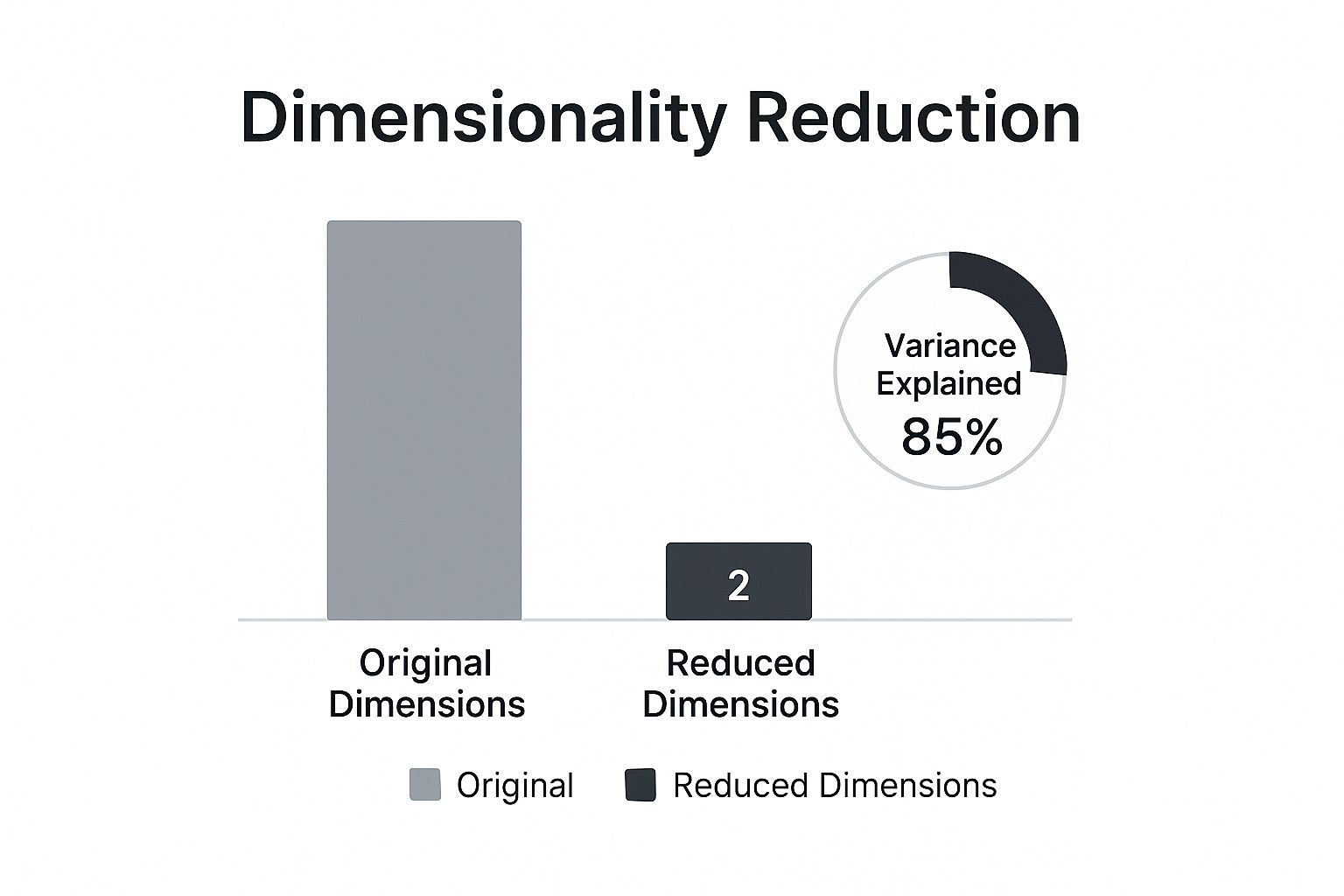
As the infographic shows, the idea is to capture the most information (in this case, 85% of the variance) with the fewest new features possible. You end up with a compressed but potent representation of your original data.
Unlike selection, extraction doesn't keep the original features. Your new components are mathematical constructs designed to capture the most important patterns from the entire dataset. This often leads to better predictive performance because the new features can uncover complex relationships that individual features might miss on their own.
But here's the trade-off: you lose interpretability. You can't easily point to one of your new features and explain its real-world meaning. Both selection and extraction are fundamental concepts we cover in our broader guide on feature engineering for machine learning.
Feature Selection vs. Feature Extraction At a Glance
Here’s a quick comparison to help you decide which dimensionality reduction approach best fits your project's needs.
| Aspect | Feature Selection | Feature Extraction |
|---|---|---|
| Goal | Keep a subset of the original features. | Create a smaller set of new features. |
| Interpretability | High. The original features are preserved. | Low. New features are mathematical combos. |
| Performance | Can improve performance by removing noise. | Often leads to higher performance by capturing variance. |
| Data Transformation | No transformation; features are just kept or dropped. | Original data is transformed into a new feature space. |
| Information Loss | Can lose information if important features are dropped. | Tries to preserve as much information (variance) as possible. |
| Best For… | Models where explaining the 'why' is crucial (e.g., credit scoring, medical diagnosis). | Complex tasks where predictive accuracy is the top priority (e.g., image recognition, NLP). |
Ultimately, the choice hinges on what you value more: the ability to explain your model's inner workings or squeezing out every last drop of predictive power.
Mastering Linear Methods with PCA
When you need a reliable, efficient, and interpretable way to simplify your data, linear dimensionality reduction techniques are the perfect place to start. Among them, one method stands out as the undisputed workhorse of the field: Principal Component Analysis (PCA). It’s a powerful feature extraction technique that transforms your data to uncover its most dominant patterns.
Think of your original dataset as a sprawling city map with thousands of intersecting streets (your features). Trying to find the most efficient route is overwhelming. PCA acts like a city planner, identifying the main "highways"—the directions where the most traffic (data variance) flows. By reorienting your map along these new highways, called principal components, you can describe the city's layout far more simply without losing the essential structure.

How PCA Actually Works
At its core, PCA is an unsupervised algorithm. This means it doesn't need any labels or target variables to work its magic; it simply analyzes the entire dataset to find the directions of maximum variance.
These directions are orthogonal (at right angles) to each other, ensuring that each new principal component is completely uncorrelated with the others. The first principal component (PC1) is the single line that captures the most variance possible. The second (PC2) grabs the most remaining variance while being perpendicular to PC1, and so on. This hierarchical approach is what makes PCA so effective.
PCA remains the most widely used dimensionality reduction technique globally, valued for both its efficiency and interpretability. Statistically, it's common for PCA to reduce thousands of input variables down to just a few dozen components while still preserving over 90% of the total variance.
Interpreting Explained Variance: A Practical Example
Let's make this more concrete. Imagine you have a dataset of customer behavior with 50 features, including things like time_on_site, pages_visited, purchase_amount, and items_in_cart. Many of these features are likely correlated with each other. For example, time_on_site and pages_visited likely move together.
When you apply PCA, you might get results like this:
- Principal Component 1: Explains 65% of the variance. This component might represent "overall customer engagement," heavily influenced by
time_on_site,pages_visited, anditems_in_cart. - Principal Component 2: Explains 20% of the variance. This could represent "purchase value," driven mainly by
purchase_amountand other spending-related features. - Principal Component 3: Explains 8% of the variance.
The cumulative explained variance of just the first three components is 93% (65% + 20% + 8%). This means you can replace your original 50 features with just 3 new, powerful features and still retain almost all of the important information in your data.
This process simplifies your dataset enormously, making it faster to train models and easier to visualize. But there's a catch. This simplification can impact model complexity. To get a better handle on how reducing features affects performance, it's helpful to review the principles of the bias-variance tradeoff, which explains the delicate balance between model simplicity and accuracy.
A Quick Look at Linear Discriminant Analysis
While PCA is the go-to for unsupervised tasks, another linear technique called Linear Discriminant Analysis (LDA) shines in supervised contexts. The key difference is that LDA uses class labels to find the feature combinations that best separate the different groups in your data.
Where PCA's goal is to maximize variance, LDA's goal is to maximize the separation between known categories. This makes it an incredibly powerful pre-processing step for classification tasks, as it actively looks for the dimensions that will make it easiest for a model to tell classes apart.
Actionable Insight:
- Use PCA when your primary goal is to reduce features for faster computation or to visualize the general structure of your unlabeled data.
- Use LDA when you have labeled data (e.g., 'fraud' vs. 'not fraud') and your goal is to improve the performance of a classification model by finding the most discriminative features.
Visualizing Complex Data with t-SNE and UMAP
While PCA is a powerful workhorse for linear data, it hits a wall when relationships get messy and nonlinear. Imagine your data points trace out a winding, tangled string in high-dimensional space. PCA, which tries to jam a straight line through it, would completely miss the intricate structure. This is exactly where modern, nonlinear techniques like t-SNE and UMAP really shine.
These algorithms act like digital mapmakers, creating a 2D or 3D "map" of your high-dimensional data. Their main job is to preserve the local neighborhood structure. Put simply, they make sure that points close together in the original high-dimensional space stay close together on the new, flattened map.
This intense focus on local relationships makes them exceptionally good at one thing: revealing hidden clusters and complex patterns that linear methods would just steamroll over.
Understanding t-SNE: The Cluster Whisperer
t-Distributed Stochastic Neighbor Embedding (t-SNE) is a probabilistic technique built from the ground up for visualization. It works by converting the vast distances between your high-dimensional data points into conditional probabilities that represent how similar they are. The core idea is to then arrange the points on a low-dimensional map (like a 2D plot) in a way that produces a nearly identical probability distribution.
Think of it like trying to arrange a group of people in a room based on their friendships. t-SNE's goal is to place close friends right next to each other, without worrying too much about the exact distance between casual acquaintances.
This approach is fantastic for teasing out distinct clusters. But, t-SNE comes with a few quirks you absolutely need to know about:
- It can be slow: t-SNE is computationally heavy. Its quadratic time complexity, O(n²), means it can really drag its feet on large datasets.
- Don't trust the gaps: The distances between clusters in a t-SNE plot are not really meaningful. A huge gap doesn't necessarily mean two clusters are more dissimilar than two clusters with a tiny gap. Its focus is on preserving the structure within each cluster.
- It's a bit random: Because it's a stochastic algorithm, running t-SNE multiple times on the same data can give you slightly different-looking visualizations.
Tuning t-SNE: A Practical Example
One of the most critical dials you can turn for t-SNE is perplexity. It’s a value that loosely defines how many neighbors each point considers when figuring out similarities. A good starting point is usually somewhere between 5 and 50.
Let's see it in action. The process is similar to what we've previously explored on DataNizant, where the focus is on making complex models easy to grasp.
import numpy as np
from sklearn.manifold import TSNE
from sklearn.datasets import load_digits
import matplotlib.pyplot as plt

# Load the MNIST digits dataset
digits = load_digits()
X = digits.data
y = digits.target

# Initialize and apply t-SNE
# A good starting perplexity is around 30 for this dataset
tsne = TSNE(n_components=2, perplexity=30, random_state=42)
X_tsne = tsne.fit_transform(X)

# Plot the results
plt.figure(figsize=(10, 8))
scatter = plt.scatter(X_tsne[:, 0], X_tsne[:, 1], c=y, cmap='viridis', alpha=0.7)
plt.legend(handles=scatter.legend_elements()[0], labels=digits.target_names)
plt.title('t-SNE Visualization of MNIST Digits')
plt.xlabel('t-SNE Component 1')
plt.ylabel('t-SNE Component 2')
plt.show()
This code generates a beautiful visualization where you can clearly see ten distinct clusters—one for each digit from 0 to 9. It’s a textbook example of t-SNE's power to reveal hidden structure.
Meet UMAP: The Faster, More Balanced Successor
Uniform Manifold Approximation and Projection (UMAP) is a newer technique that has quickly become a fan favorite, often seen as a direct improvement on t-SNE. While it shares the same goal of preserving local structure, it brings some serious advantages to the table.
For starters, UMAP is significantly faster than t-SNE, which makes it a practical choice for much larger datasets. More importantly, it often does a better job of preserving the global structure of the data. This means the distances between clusters in a UMAP plot can actually be meaningful, giving you a better sense of how different groups relate to each other on a bigger scale.
UMAP strikes a powerful balance between performance and fidelity. It's fast enough for large-scale exploration while preserving both local and global data structures, making it a versatile tool for modern data analysis.
The key hyperparameters you'll work with in UMAP are n_neighbors and min_dist.
n_neighbors: This is similar to perplexity in t-SNE and controls how UMAP balances local versus global structure. A smaller value zooms in on fine-grained local detail, while a larger value helps capture the bigger picture.min_dist: This controls how tightly packed points can get in the final plot. A small value creates dense, compact clusters, while a larger value gives points more breathing room.
So, how do you choose? If your one and only goal is to identify and visualize very fine-grained local clusters, t-SNE is still an excellent tool. But for a faster, more scalable option that also gives you a better sense of the overall data landscape, UMAP is generally the go-to starting point for nonlinear visualization today.
Applying Dimensionality Reduction in the Real World
Knowing the theory behind dimensionality reduction is one thing, but its real power comes alive when you apply it to solve actual business problems. Across just about every industry, these methods are the secret sauce for unlocking insights from overwhelmingly complex data, turning a sea of features into clear, actionable intelligence.
Whether it's spotting a face in a crowd or speeding up genetic research, the applications are as diverse as they are impactful. By simplifying data in a smart way, organizations build machine learning models that are faster, more accurate, and way more efficient. But here's the catch: the choice of technique is never one-size-fits-all. It hinges entirely on the problem you're trying to solve.

From Facial Recognition to Fraud Detection
Let's walk through a few practical scenarios where these techniques are making a real difference. Each one shows how a specific method is uniquely suited for a particular challenge.
-
Facial Recognition with PCA: Think about a high-resolution image. To a computer, it's just a massive grid of pixel values, easily running into thousands of features. PCA shines here by finding the core patterns of variation across many faces—things like the general shape of a nose or the distance between eyes. It creates what are called "eigenfaces," which are principal components that capture these essential facial features, radically shrinking the data's size while keeping the most identifiable information.
-
Text Analysis in NLP: In Natural Language Processing (NLP), we often turn words into high-dimensional vectors known as embeddings. Using techniques like PCA or Autoencoders to reduce these dimensions makes text classification and sentiment analysis models much faster to train. It also makes them less prone to overfitting, all without losing much of the original semantic meaning. As we cover on DataNizant, techniques like these are fundamental to modern language models.
-
Bioinformatics and Gene Expression: When you're analyzing gene expression data, you're dealing with datasets that have thousands of genes (features) but a relatively small number of samples. This is where nonlinear methods like t-SNE and UMAP are perfect. They can uncover complex, non-obvious clusters of genes that are co-regulated, helping researchers pinpoint biological pathways linked to diseases.
This journey from theory to practice has a long history. It all started when Karl Pearson introduced PCA way back in 1901, but things really took off in the late 20th century with the explosion of machine learning. Breakthroughs like t-SNE and UMAP in the 2000s were built specifically to untangle the messy, nonlinear complexity of modern datasets, making dimensionality reduction an indispensable tool in genomics, NLP, and computer vision today.
Choosing the Right Tool for the Job
Picking the right dimensionality reduction technique is a critical decision that will make or break your project's outcome. The flowchart above is a great starting point, but let’s break down the thinking process a bit more.
Ask yourself these key questions:
-
Is Interpretability a Priority?
- Yes: Your best bet is feature selection or PCA. Feature selection keeps the original, understandable variables. While PCA creates new features, you can often interpret them by looking at which original features they're made of.
- No: If all you care about is raw predictive power, then nonlinear methods like UMAP or Autoencoders are excellent choices, even though their resulting features are essentially "black boxes."
-
What Is Your Main Goal?
- Visualization: t-SNE and UMAP are the undisputed champs for creating clean 2D or 3D plots that reveal hidden clusters and data structures.
- Preprocessing for a Model: PCA is a fast and reliable default for cleaning up data before feeding it into a supervised learning algorithm. For classification tasks, LDA is even better because it specifically looks for features that separate your classes. Handling complex data is a huge challenge in AI, and you can see a great example of this in how Kyve Network is powering the next generation of AI agents.
-
How Large Is Your Dataset?
- Small to Medium: PCA and t-SNE work quite well. Just keep in mind that t-SNE starts to slow down on very large datasets.
- Large: UMAP is often a better choice than t-SNE because it's significantly faster and more scalable. For absolutely massive datasets, you might need to look into simplified methods or incremental PCA.
Actionable Insight: Start with PCA. It’s fast, interpretable, and gives you a fantastic baseline. If you suspect its linear assumptions don't fit your data—meaning you think there are complex, nonlinear patterns hiding in there—then switch to UMAP for visualization or an Autoencoder for feature extraction. This tiered approach saves you time and stops you from using a complicated tool when a simple one does the job just fine.
In fact, dimensionality reduction is a crucial first step in our guide on anomaly detection techniques, where simplifying data is key to isolating unusual patterns more effectively. As we explore in our article
https://datanizant.com/anomaly-detection-techniques/, this preprocessing step can dramatically improve an algorithm's ability to spot outliers.
Frequently Asked Questions
When you start digging into dimensionality reduction, a few practical questions always seem to pop up. Let's tackle some of the most common ones to clear up any confusion and help you apply these techniques with more confidence.
How Do I Decide How Many Components to Keep in PCA?
Choosing the right number of components in PCA is part art, part science. It’s a critical balancing act between keeping your model simple and not throwing away valuable information. Instead of just picking a number out of thin air, there are a few solid, data-driven ways to find that sweet spot.
The most popular method is looking at the 'explained variance'. After you run PCA, you can create a plot that shows the cumulative variance explained by the components. The idea is to find the smallest number of components that still capture a huge chunk of your data’s story—usually, people aim for a threshold of 90% or 95%.
Another great technique is the 'elbow method'. If you plot the variance explained by each individual component, the graph will often look like an arm, with a sharp "elbow" bend. That elbow point is your signal that adding more components isn't giving you much bang for your buck, making it a natural place to stop. For a quick-and-dirty rule of thumb, some folks use Kaiser's Rule, which just says to keep any components with an eigenvalue greater than 1.
Can I Use t-SNE or UMAP for More Than Just Visualization?
Absolutely. While t-SNE and UMAP are rockstars at creating those beautiful, insightful visualizations, their usefulness doesn't end there. They can be a surprisingly effective preprocessing step, especially for clustering tasks.
Think about it: both algorithms are designed to honor the local, neighborhood structure of your data. If you run a clustering algorithm like DBSCAN on their 2D or 3D output, you can often uncover clusters that are far more defined and meaningful than what you'd get from the original high-dimensional mess. They essentially "pre-sort" the data points, making it much easier for the clustering algorithm to spot the dense groups.
But here’s a word of caution. It's generally a bad idea to feed the output of t-SNE or UMAP directly into a supervised learning model for something like classification. These methods don't really preserve global distances, and the transformation they perform isn't something you can easily apply to new, unseen data—which is a deal-breaker for most predictive models.
When Should I Use PCA Instead of an Autoencoder?
The choice between PCA and an autoencoder really boils down to two things: the complexity of your data and your need for interpretability. They both extract features, but they get there in fundamentally different ways.
Actionable Insight: Start with PCA as your baseline. It's fast, computationally cheap, and highly interpretable. Only move to a more complex tool like an autoencoder if PCA's performance is insufficient and you have strong reason to believe your data contains important nonlinear patterns.
Here’s a simple breakdown to help you decide:
- Choose PCA when you suspect the important relationships in your data are mostly linear. It’s also the go-to when your dataset isn't massive and you value speed and the ability to clearly explain what your new components mean.
- Opt for an autoencoder when you’re wrestling with complex, nonlinear patterns that PCA would completely miss, like those found in image or audio data. As a type of neural network, autoencoders are more powerful, but they’re also more expensive to train, hungrier for data, and their features are often a "black box." The complexity of these models also brings up important considerations around oversight, a topic we explore in our guide on AI governance best practices.
At DATA-NIZANT, we are dedicated to demystifying complex data science and AI topics. Our expert-authored articles provide the actionable intelligence you need to stay ahead. Explore our insights at https://www.datanizant.com.

